Sport · football performance academy
2026
BE EVO
BE EVO is born in Valencia as a football performance academy for players aged 10 to 14: high-performance methodology and applied technology to develop footballers who aim for the top level.

The project covered the whole identity: logotype and construction, spacing rules and reduction test, the TARS partnership, colour and type systems, a line/full icon set and the competitive ecosystem's applications: player cards, match days, standings tables, kits and the social feed.
BE EVO
It's about to begin.
Sport · football performance academy
2026
The project covered the whole identity: logotype and construction, spacing rules and reduction test, the TARS partnership, colour and type systems, a line/full icon set and the competitive ecosystem's applications: player cards, match days, standings tables, kits and the social feed.
Challenge
The brand had to speak to two audiences at once — kids who dream of turning pro and the families who decide — without falling into childish cliché or the corporate solemnity of classic academies.
Strategy
Football training like never before.
The positioning rests on three ideas: performance (serious, measurable methodology), technology (data and tools serving the player) and belonging (team, league, community). For a twelve-year-old, the aspirational language isn't the academy's: it's the sports videogame's — player cards, stats, overall, match days. BE EVO adopts that code and fills it with real training content.
For families, the same identity demonstrates method: every graphic piece organises information — levels, groups, calendars, standings — with the visual discipline of a professional sports organisation. The brand promises evolution and shows it: from the first training session to GRAND FINALS.

Identity
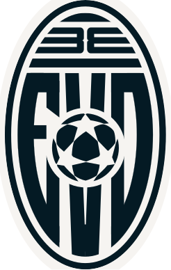
The logotype is modularly constructed: BE and EVO articulate over a bar that fixes proportions, clear space — always equal to the bar's height — and letter spacing. The construction is put through a reduction test to guarantee the forms hold from pitch-side banner to favicon, and the rules explicitly forbid altering the internal spacing: those proportions are part of the mark's drawing.
The identity is also born with a technology partner inside: TARS. The partnership rules fix how both logotypes live together — hierarchy, separation, versions — to ensure a coherent, recognisable presence in any shared context.
Construction & reduction
160px96px56px32pxBE EVO × TARS partnership — type lockup (demo)
The cohabitation rules fix hierarchy, minimum separation and lockup versions: a coherent, recognisable presence in any shared context.
The official co-branding rules live in the brand plates above — this piece demonstrates the type system, not the official lockup.

System
Colour is the brand's operating system: eight ramps — neutrals, aqua, purple, fire red, electric blue, orange, green and lime — with their steps documented in HEX. The breadth is deliberate: an ecosystem with seventeen teams, three competitions and progression levels needs more than a corporate colour; it needs a palette that can encode without repeating itself.
Two families share the voice. Le Murmure, the brand typeface, brings the emotional, expressive layer: it represents each player's individual growth and the capacity to break limits. Science Gothic, the secondary, is a variable typeface designed to be global, versatile and distinctive on screen: it carries data, labels and everything that must read fast. The icon set follows in two styles — line and full — for interface and signage.
Neutrals
8 tonesLe Murmure — brand typeface
Football training like never before
It represents each player's individual growth, creativity inside the game and the capacity to break limits.
Science Gothic — variable secondary
wght 500
The quick brown fox — 0123456789
Designed to be global, versatile and distinctive on screen: it carries data, labels and everything that must read fast.
Sport iconography — eight pictograms
Applications
The identity was tested where it will live: player cards with stats — Sho, Def, Pas, Dri — and overall, match-day posters (DAY 01, SEMIFINALS, GRAND FINALS), BE EVO LEAGUE standings tables with their teams, kits and the Instagram feed. The gaming code isn't decoration: it's the interface through which a player watches their own evolution.
The three competitions — BE EVO CHALLENGE, BE EVO LEAGUE and EVO CHAMPION CUP — share the system but are distinguished by colour and composition, so the season's full calendar communicates without stepping outside the brand rules.
Alejandro Palacios, Striker. Sho 86, Def 42, Pas 78, Dri 91. MVP.
Press to flip the card
System demo — illustrative data
| # | Team | Points |
|---|---|---|
| 1 | Las Alarconas | 9 |
| 2 | Los Cañetes | 7 |
| 3 | Flow & Show | 7 |
| 4 | Los Dragones de la Cancha | 6 |
| 5 | Los Halcones de la Ciudad | 5 |
| 6 | Los Delfines de la Playa | 4 |
| 7 | Los Osos del Bosque | 2 |
| 8 | Los Rápidos de la Ruta | 1 |

Feed recreated in code — 9 posts
System application — demo colourways
Outcome
Start the engine. Valencia, 2026.
The outcome is an identity system ready for opening day: mark construction and usage, cohabitation rules with technology partner TARS, eight documented colour ramps, two type families with defined roles, a two-style icon set and the full competitive ecosystem — BE EVO CHALLENGE, BE EVO LEAGUE and EVO CHAMPION CUP — designed from the player card to match day.